
Those who have recently clicked on one of their ancestor’s pages in the FamilySearch Family Tree may have noticed a new design.
Aimed to be more readable, interactive and consistent with the rest of the site, the new look and feel of the person page includes a new tab and other upgrades.
A FamilySearch blog post published Thursday, Aug. 4, details the new page.
What’s new?
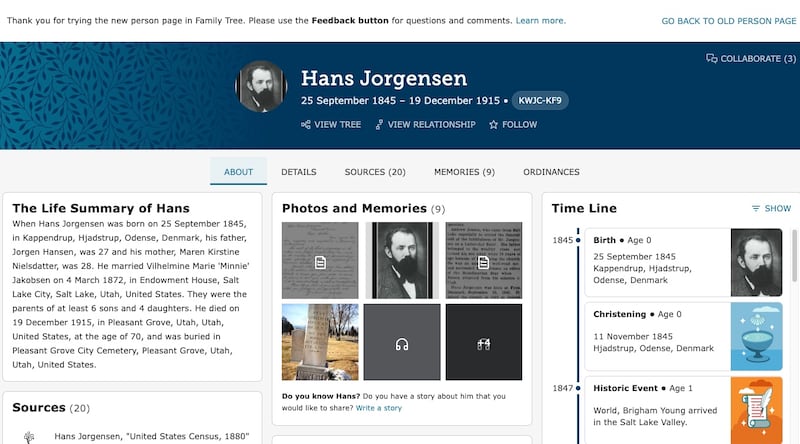
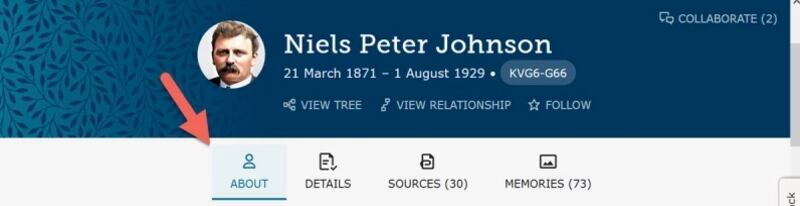
An About tab has been added to the person page, located near the top next to Details, Sources and Memories.
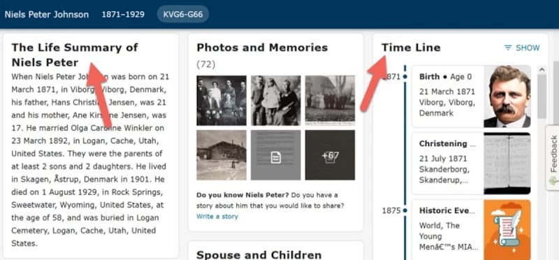
The About tab is like an interactive get-to-know-you page for an ancestor that summarizes important information about them. Features on this page may include a life summary, timeline, brief history of the ancestor’s name, an excerpt from a story uploaded to their Memories gallery, and quick summaries of their spouses, children and other family members.
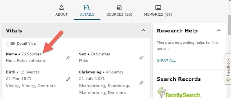
Improved Details tab
The Details tab features a more complete, source-based account of an ancestor’s life. Users can review and contribute to information in this tab.
Improvements include an icon that displays a list of what documents are contributing to an ancestor’s information, adjusted fields in the Other Information section, and the ability to record nonfamily relationships. These relationships include apprenticeship, employment, Godparent, household, neighbor, relative and slavery.
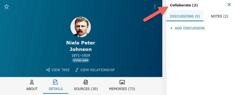
Updated collaboration tool
Rather than being in a separate tab, research notes and discussions using the collaboration icon are displayed in a side sheet that stays open until closed — making these notes more visible and accessible. The collaborate feature is located on the top right side of the page.
How to test the new page
FamilySearch is inviting users to help them test the new person page. To see the changes, log into the Family Tree and visit an ancestor’s page (here are step-by-step instructions). The update is being turned on gradually and the new design may not yet appear for some pages.
To submit feedback, click the feedback button on the right side of the page or leave a comment in the FamilySearch Community.
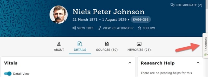
Users can switch back and forth between the old and new version by clicking the toggle in the banner at the top. Later, the new design will be fully implemented and will replace the old design for the person pages.
Read more about the redesigned person page on FamilySearch’s blog.
